Project Overview
BAUL Brunch & Café is a culture-inspired café brand rooted in Baul philosophy. The brand focuses on simplicity, creativity, and warmth. The goal of this project was to design a logo that feels soulful yet modern. The logo needed to work well in both physical and digital spaces.
Design Objective
The main objective was to create a logo that feels unique and meaningful. It had to reflect Baul culture without looking traditional or outdated. The logo also needed to be flexible for signage, menus, and social media use. In addition, the brand required a bilingual logo system.
Concept and Inspiration
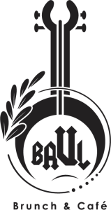
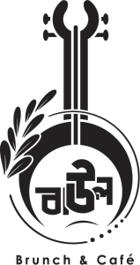
The logo concept is inspired by the ektara, a musical instrument linked to Baul singers. The ektara stands for simplicity and self-expression. Because of this, it fits naturally with the café’s vision. It also adds cultural depth to the brand identity.
Symbol and Shape
The logo uses a circular form to express unity and balance. Cafés are social places where people meet and relax. Therefore, the circle supports this idea clearly. The vertical structure of the ektara adds stability to the design.
Visual Style
The design includes soft, organic strokes to create a handcrafted feel. These details add warmth and human touch. At the same time, the logo stays clean and minimal. This balance keeps the design modern and timeless.
Bilingual Logo Design Approach
Design Strategy
The logo was designed as a bilingual identity in English and Bengali. This helps the brand communicate with a wider audience. At the same time, it keeps the cultural connection strong. As a result, the brand feels both local and inclusive.
Bengali Logo Version
The Bengali version represents the cultural and emotional side of the brand. It connects directly with Baul tradition and local identity. Because of this, it builds trust and familiarity with the audience.
English Logo Version
The English version supports the café’s modern brunch positioning. It improves clarity across digital platforms and urban spaces. This version also helps visitors understand the brand easily.
Language Balance
Both logo versions were designed with equal importance. Spacing and proportions were carefully adjusted. Therefore, neither version feels secondary or translated.
Typography
Custom typography was created for originality. The lettering feels bold, clear, and balanced. It also complements both language versions smoothly.
Color Choice
A black-and-white color palette was selected for flexibility. It ensures strong contrast and clear visibility. Moreover, it works well across all branding materials.
Logo Usage
The logo works well on signage, menus, packaging, and social media. It stays clear at small and large sizes. This makes it suitable for long-term branding.
Final Result
The final logo combines cultural meaning with modern design. The bilingual system strengthens brand connection. Overall, the logo is clean, versatile, and future-ready.


