
Google Display Ads appear while people browse websites, read articles, or watch videos. Users do not stop to analyze ads carefully. They notice them for a brief moment and decide whether to ignore them or click.
This means your banner must communicate value almost instantly. A good banner design builds trust, highlights the offer, and guides the user toward action. A bad design does the opposite. It confuses users, reduces engagement, and slowly drains your advertising budget.
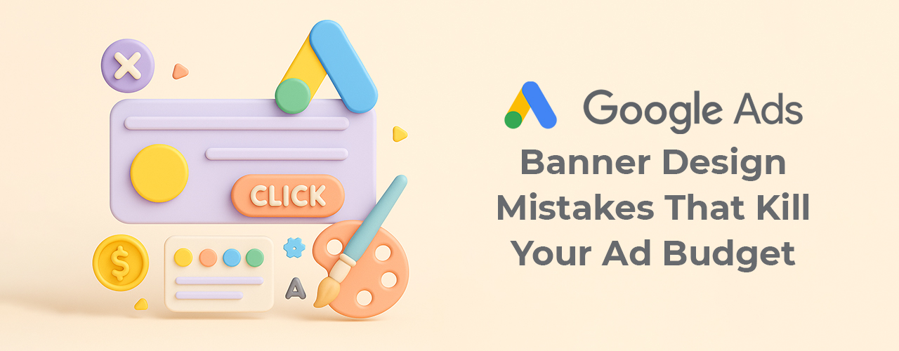
Design is not decoration. In Google Ads, design directly affects performance.
Using Too Much Text Ruins Banner Performance
One of the most common mistakes in Google Ads banner design is adding too much text. Many advertisers try to explain everything inside a single banner. They include features, offers, contact details, and long taglines all at once.
As a result, the banner looks crowded. Text becomes hard to read, especially on smaller ad sizes and mobile screens. Users scroll past without understanding the message.
A better approach is to keep the message focused. A banner should communicate one clear idea. When text is minimal and well-spaced, the message becomes easier to understand. This alone can significantly improve click-through rates.
Missing Call to Action Confuses Users
Some banners look visually appealing but fail to guide users toward the next step. They show a logo, an image, and a line of text, but they never clearly ask the user to do anything.
Without a call to action, users do not know what is expected. Even interested users may ignore the ad because there is no direction.
A strong call to action solves this problem. Simple phrases like “Learn More,” “Get a Free Quote,” or “Start Now” give users clarity. When the CTA is visible and easy to understand, users are more likely to click.
At 51Shades.in, every Google Ads creative is designed with a clear and visible call to action, even at the smallest banner sizes.
Designing Only One Size Is a Costly Mistake
Google Display Ads require multiple banner sizes. However, many DIY advertisers design only one banner and stretch it across all formats. This practice damages layout, alignment, and readability.
Text may get cropped, logos may appear distorted, and important elements like CTAs may disappear on mobile screens. When this happens, Google may limit impressions, and users lose trust instantly.
Designing for multiple sizes does not mean starting from scratch each time. A flexible layout system works better. When key elements are positioned safely and adapted properly, the same design concept can perform well across all required Google Ads sizes.
Poor Color Contrast Makes Ads Invisible
Color contrast plays a major role in readability. Unfortunately, many banners fail because text blends into the background. Light text on light images or dark text on dark backgrounds makes content unreadable.
When users struggle to read an ad, they ignore it. No matter how good the offer is, poor contrast prevents communication.
Choosing high-contrast color combinations improves clarity instantly. Simple background colors and clean overlays help text stand out. This is especially important for mobile users who view ads on small screens under different lighting conditions.
Generic Stock Images Reduce Trust
Many Google Ads banners rely on overused stock images. Smiling people, fake office setups, and unrealistic visuals make ads look generic. Users recognize these images instantly and associate them with low-quality advertising.
Trust is critical in advertising. When visuals look fake, users hesitate to click.
Using clean illustrations, abstract graphics, or product-focused visuals often performs better. Authentic design elements help banners feel more real and relevant. Even simple shapes and icons can outperform generic stock photos when used correctly.
Weak Headlines Fail to Capture Attention
The headline is the first thing users notice. However, many banners use vague or generic headlines that fail to spark interest. Phrases like “Best Services” or “Quality Solutions” do not communicate value.
A strong headline addresses a problem or benefit directly. It tells users why the ad matters to them. Clear, benefit-driven headlines attract attention and encourage engagement.
Good headlines are short, readable, and emotionally relevant. They work together with visuals to create instant clarity.
Overusing Logos Hurts Conversions
Branding is important, but excessive logo usage can harm performance. Some banners place large logos at the center, leaving little space for messaging or calls to action.
When the logo dominates the banner, users see branding but no value. This reduces clicks and makes the ad feel like passive brand awareness instead of an active invitation.
A better approach is subtle branding. Place the logo in a corner and let the message lead. The goal is to convert interest into action, not just show the brand name.
Lack of Visual Hierarchy Creates Confusion
Effective banner design guides the viewer’s eyes naturally. Poor design treats all elements as equally important. When everything competes for attention, users feel overwhelmed.
Visual hierarchy solves this issue. Larger text draws attention first, followed by supporting content and then the call to action. Proper spacing and alignment help users understand the message quickly.
When hierarchy is clear, banners become easier to scan. This improves engagement and increases click-through rates.
Ignoring Mobile Users Lowers Performance
Most Google Display Ads are viewed on mobile devices. Despite this, many banners are designed only for desktop screens. Small text, tight spacing, and tiny buttons make mobile interaction difficult.
Mobile-first design ensures that banners remain readable and clickable on smaller screens. Testing banners on mobile sizes before launching campaigns helps avoid costly mistakes.
Designing with mobile users in mind often improves overall performance across all devices.
Inconsistent Branding Breaks Trust
Running multiple banners with different fonts, colors, and styles confuses users. Inconsistent branding reduces recognition and weakens credibility.
Consistency creates familiarity. When users see similar visuals across different ads, trust builds gradually. This leads to better engagement and higher conversion rates over time.
A simple brand system with consistent colors, typography, and layout structure helps maintain visual harmony across all Google Ads creatives.
DIY Tools Can Work If Used Correctly
DIY tools like Canva and Figma make ad design accessible. However, tools alone do not guarantee results. Understanding layout, spacing, and messaging is essential.
Using grids, safe zones, and size-specific layouts improves outcomes. Testing designs at smaller sizes before publishing helps identify readability issues early.
At 51 Shades Graphic Design, we often refine DIY-created banners by improving structure and hierarchy rather than completely redesigning them.
When Professional Design Becomes Necessary
DIY creatives are useful for testing, but long-term advertising success requires professional design. When ad spend increases, small design flaws become expensive.
If campaigns show low CTR, inconsistent branding, or poor engagement despite good targeting, professional help can make a significant difference.
51 Shades specializes in Google Ads banner design that focuses on clarity, consistency, and conversion. Our goal is not just to make ads look good, but to make them perform.
Final Thoughts
Google Ads do not fail because of the platform. They fail because of weak creative design.
Improving banner clarity, readability, and structure often delivers better results than increasing budgets. Before spending more, fix the design.
Strong design saves money. Poor design wastes it.


