
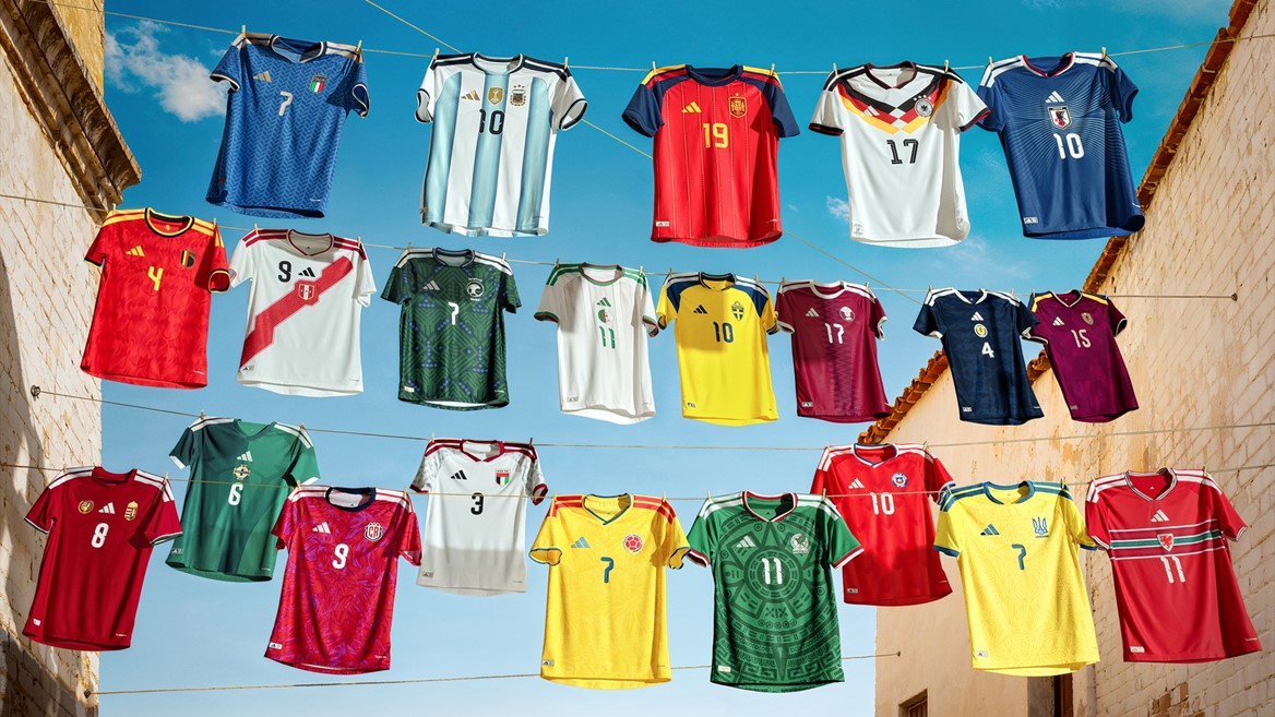
Adidas Drops Its Biggest World Cup Collection Ever
Adidas just revealed its largest-ever collection of national team jerseys ahead of the FIFA World Cup 2026 — twenty-two bespoke designs that fuse heritage, innovation, and national pride. Each shirt pulls inspiration from the country’s culture, landscapes, and football legacy while showcasing Adidas’ newest tech fabrics like CLIMACOOL+ and 3D stretch mesh for top performance.
But here at 51 Shades, we’re not just about performance — we’re about visual storytelling. So, we’ve ranked these jerseys purely on design: creativity, color harmony, and how well they capture the identity of each nation.
Let’s dive in — from clean minimalism to loud cultural pride.
#1 – Japan ????????
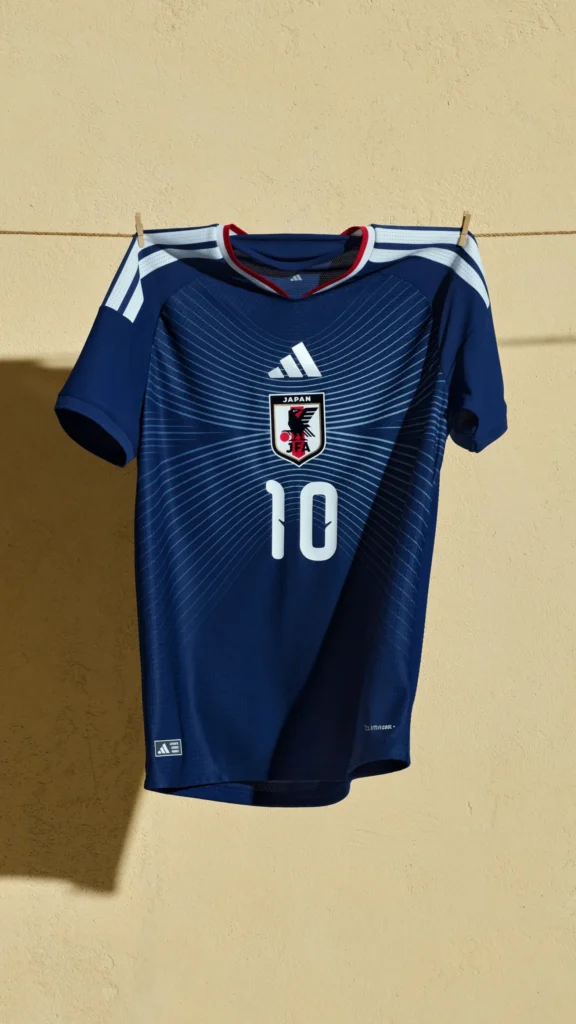
The deep ocean-blue base, laced with ash-blue horizon lines, is poetry in motion. It mirrors where Japan’s sky meets the sea — calm, balanced, and distinctly Japanese. It’s modern without shouting, elegant without trying too hard.
Verdict: Pure design discipline.
#2 – Mexico ????????
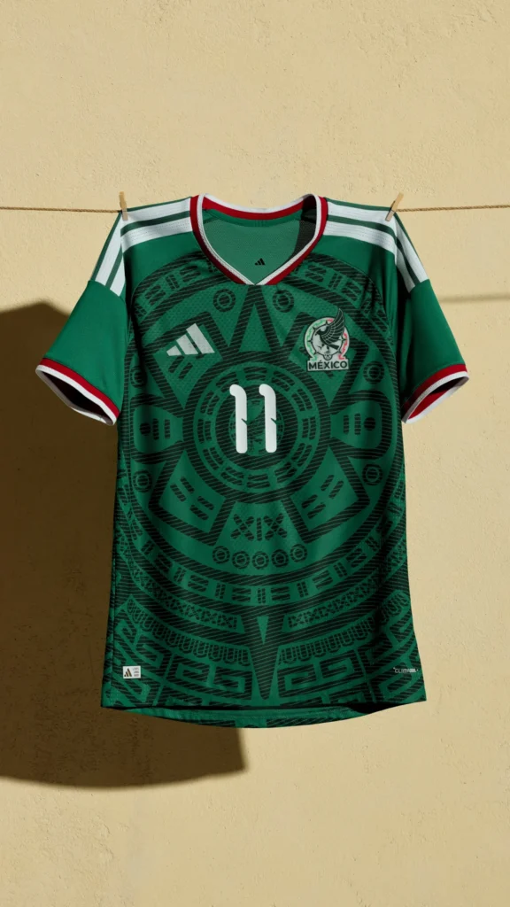
Aztec geometry reborn. The bold emerald tone, intricate cultural detailing, and “SOMOS MÉXICO” neck print hit the sweet spot between legacy and freshness. A national story told through texture.
Verdict: Cultural pride woven into fabric.
#3 – Argentina ????????
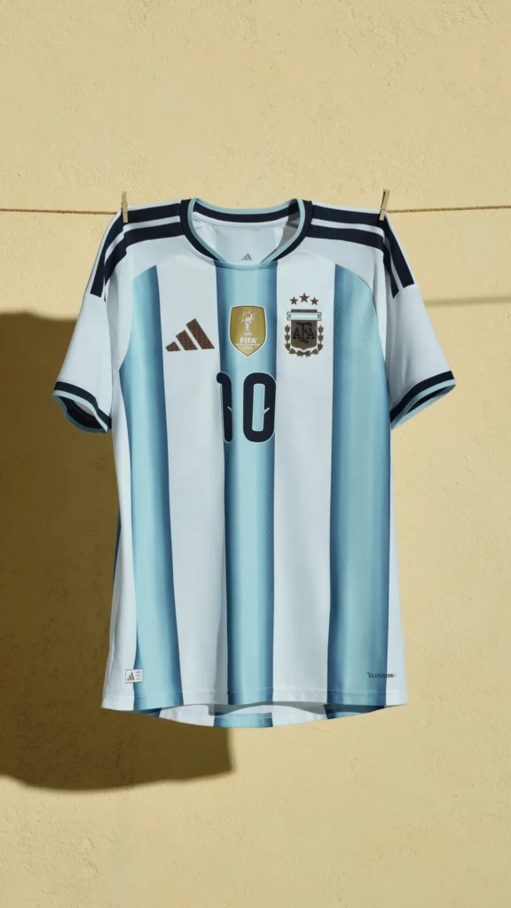
Classic, but reimagined. The sky-blue and white stripes fade through three shades — representing the three World Cup wins (1978, 1986, 2022). It’s a masterclass in subtle symbolism.
Verdict: Tradition meets evolution.
#4 – Germany ????????
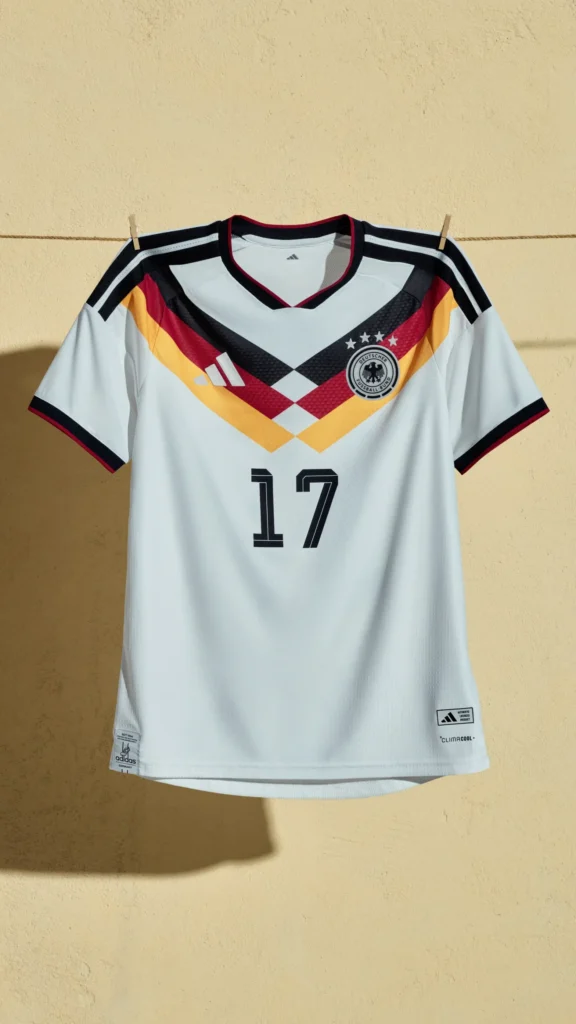
Minimalism with bite. The new diamond and chevron pattern nods to past glories while keeping the white-black palette pristine. The heritage energy is strong here.
Verdict: A timeless powerhouse, once again reinvented.
#5 – Italy ????????
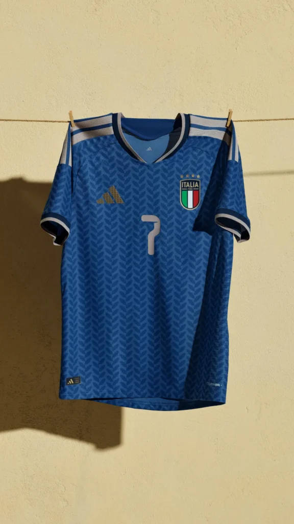
The Azzurra blue gleams deeper this year — sleek, confident, and unmistakably Italian. Gold lettering across the neck reads Azzurra, reminding everyone this is fashion, not just sport.
Verdict: Elegant. Effortless. Italian.
#6 – Spain ????????
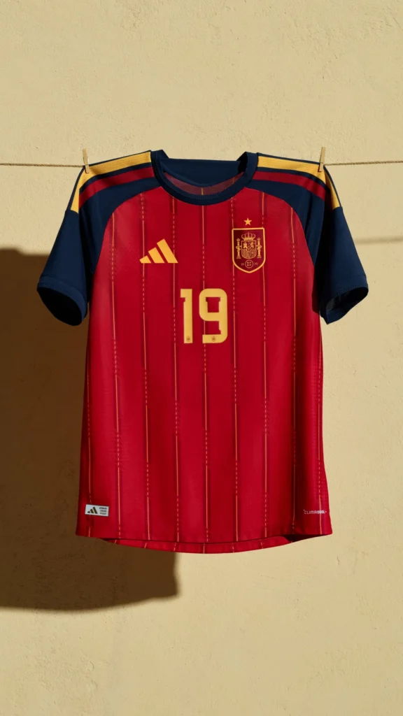
Clean pinstripes over deep red — a nod to the national flag, a wink to tradition. It’s sharp, simple, and instantly recognizable.
Verdict: Classic flair with precision lines.
#7 – Colombia ????????
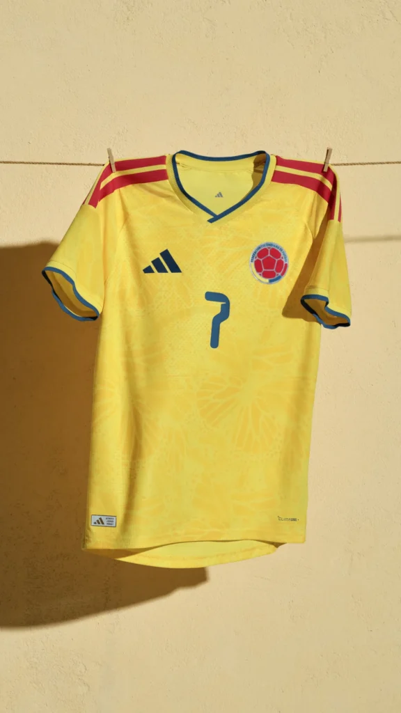
Vibrant yellow meets fine pattern detailing that feels alive. Energetic, youthful, and unapologetically Latin.
Verdict: Sunshine energy bottled in a kit.
#8 – Sweden ????????
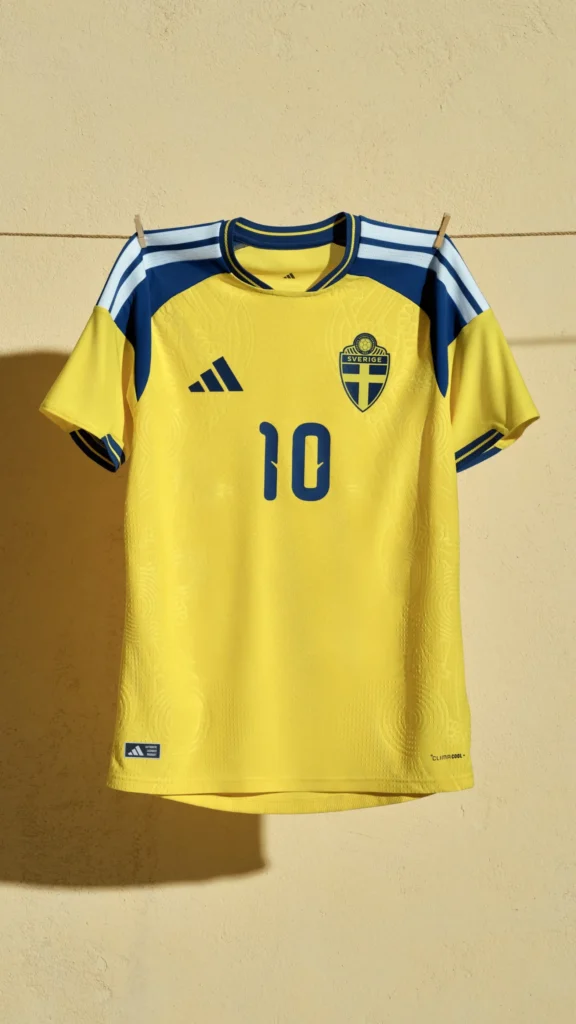
Yellow and blue — bright, bold, and confident. A clean execution that feels Scandinavian in its simplicity.
Verdict: Simple done right.
#9 – Belgium ????????
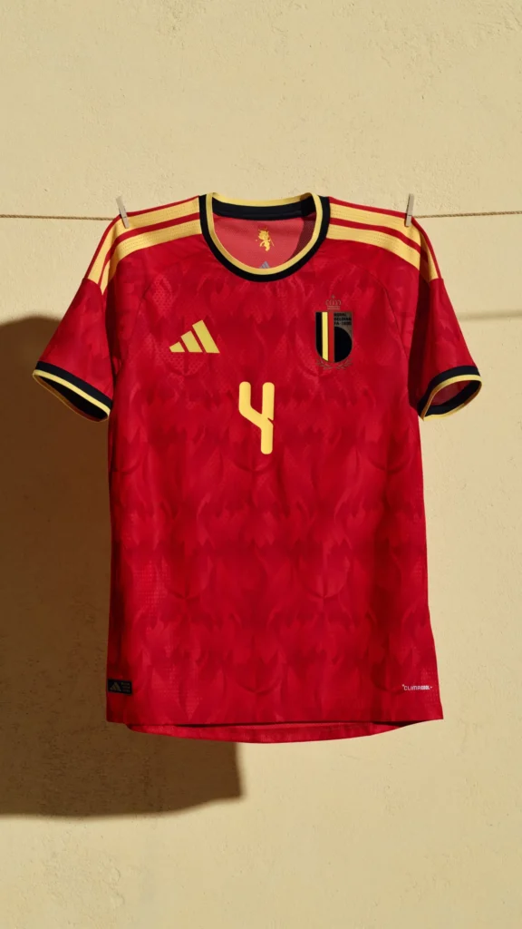
Subtle texture, fiery red, and gold accents. It’s powerful yet restrained — just like the football they aim to play.
Verdict: Strong lines. Strong identity.
#10 – Saudi Arabia ????????
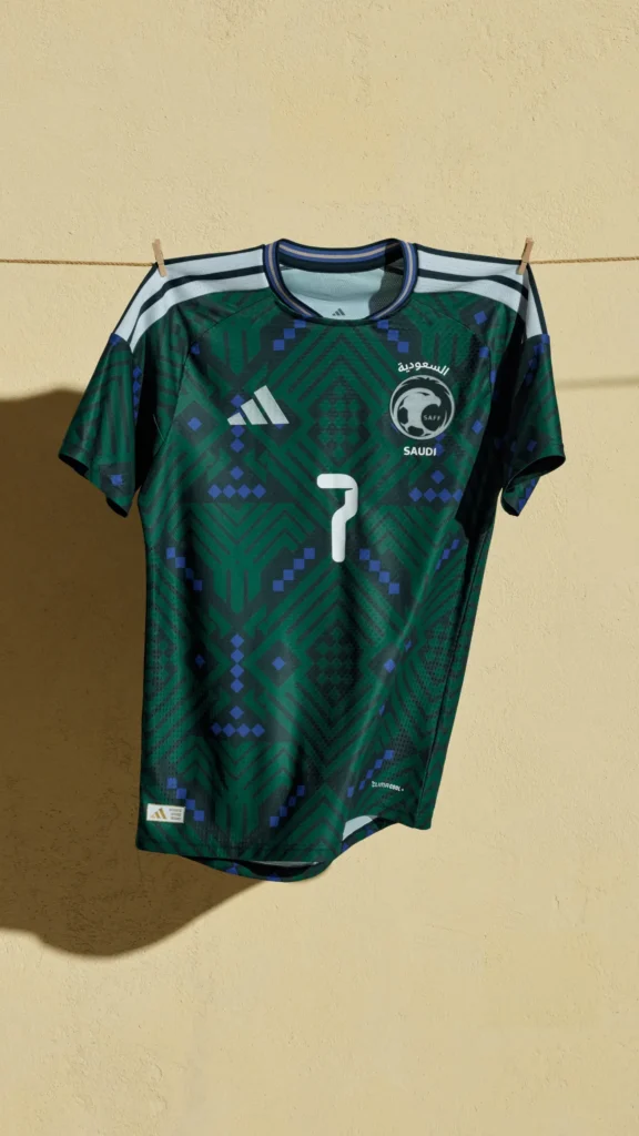
Dark green, tonal patterns, and sharp contrast details. It feels rich and tactical — exactly how a Saudi kit should look.
Verdict: Sleek, royal energy.
#11 – Wales ????

A bold red canvas with classic horizontal striping. Minimal but emotional, evoking old-school football memories.
Verdict: Nostalgic and proud.
#12 – Chile ????????
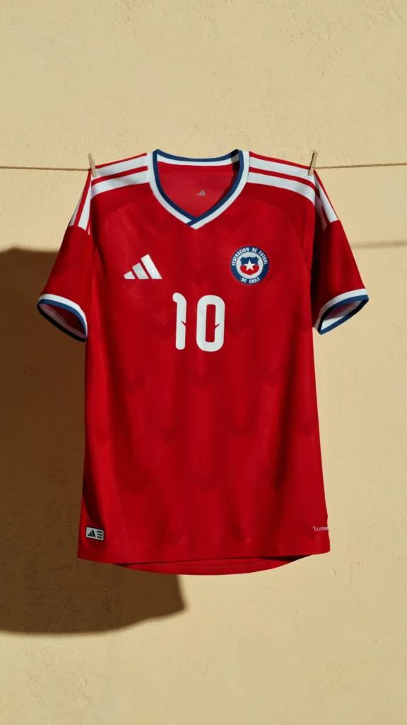
Vivid red with sharp blue collar trims. It’s bold, energetic, and screams South American football passion.
Verdict: A crowd-pleaser.
#13 – Scotland ????
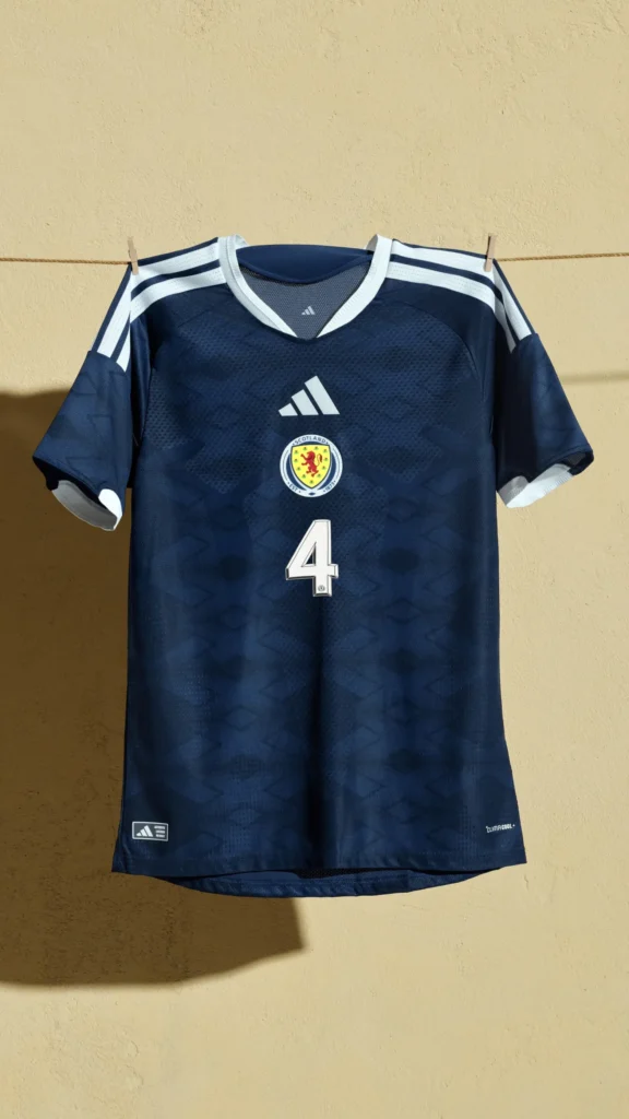
Deep navy tones with sharp contrasts make this a quiet beauty. Nothing loud — just clean, consistent design.
Verdict: Reserved brilliance.
#14 – Ukraine ????????
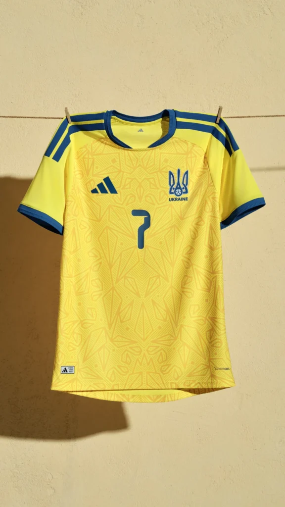
Vibrant yellow with embossed patterning symbolizing national motifs. It glows with hope and resilience.
Verdict: Symbolic and strong.
#15 – Hungary ????????

A classic crimson palette reworked with modern cutlines. Simple, but a little too safe compared to others.
Verdict: Understated heritage.
#16 – Peru ????????

The diagonal sash is iconic — always will be. But visually, it’s a straight replay from the past. Timeless, but not bold.
Verdict: Beautiful tradition, minimal innovation.
#17 – Venezuela ????????
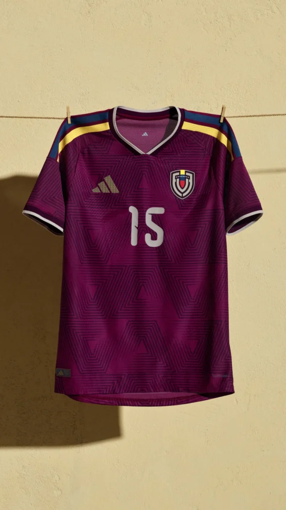
Rich maroon tones shine under the light. It’s sleek but lacks distinct graphic elements this time around.
Verdict: Elegant, but forgettable.
#18 – Qatar ????????

Soft cream base and burgundy detailing — classy, yet slightly understated for a host-inspired follow-up.
Verdict: Tasteful but low impact.
#19 – Costa Rica ????????
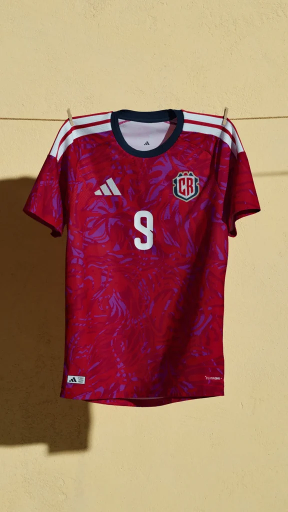
Strong primary red with pattern texture, but it’s missing the extra detail to elevate it above the pack.
Verdict: Solid, but standard.
#20 – UAE ????????
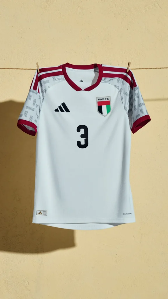
White base with gentle patterning — simple and formal. Feels more ceremonial than sporty.
Verdict: Minimalism with restraint.
#21 – Northern Ireland ????????
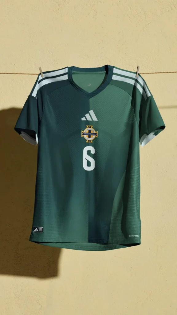
Green always looks good, but this version leans too generic. It could’ve used sharper national cues.
Verdict: Missed design opportunity.
#22 – Algeria ????????
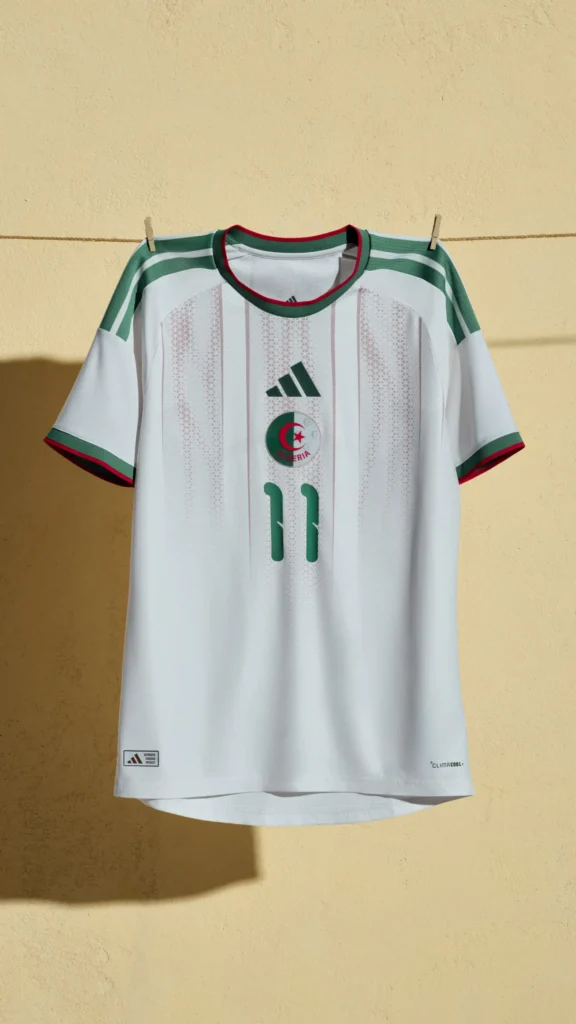
White base accented with green diagonal lines and geometric patterning inspired by desert dunes and Islamic art.
Verdict: Clean, symbolic, and quietly beautiful.
Final Thoughts
This collection proves Adidas still owns the storytelling side of football design. The best kits — Japan, Mexico, and Argentina — fuse national identity with sleek, wearable modernism. Others stay conservative, but the range as a whole celebrates diversity and culture in every stitch.
As designers, we see these not just as jerseys — but as moving canvases. Each one is a nation’s brand, carried across the biggest stage in sport.
Which one’s your favorite?
And if you’re a brand ready to build your own iconic visual identity — from jerseys to logos — explore 51Shades.in or find us on Google Business Profile.


