
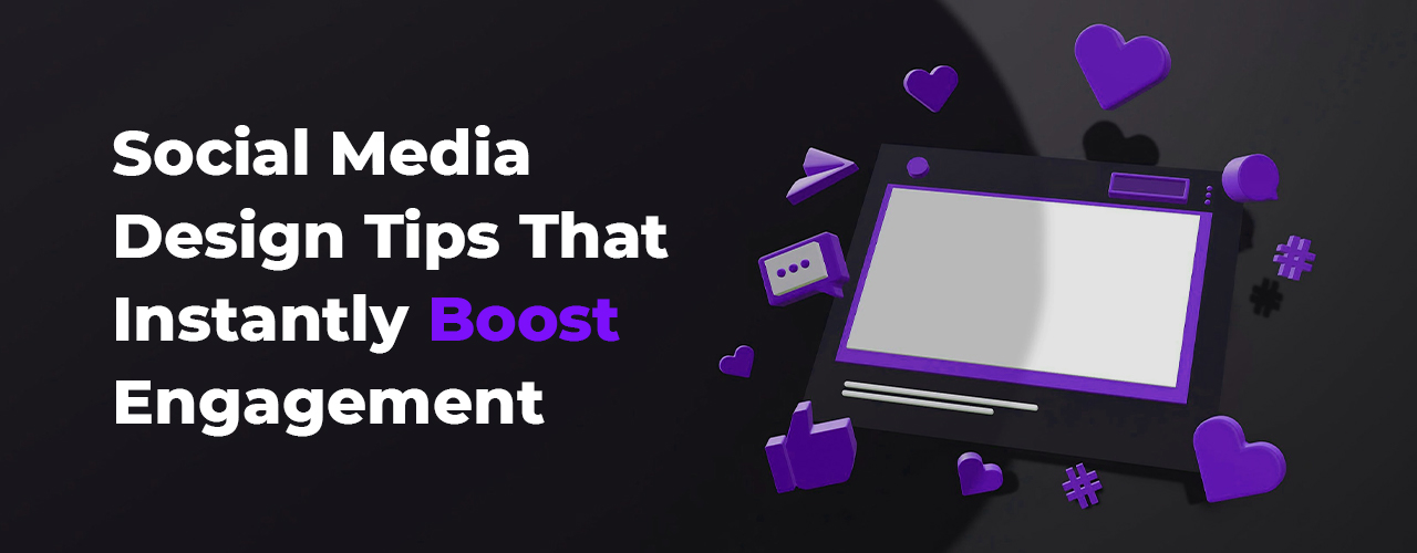
Introduction: Why Social Media Design Matters for 51 Shades
At 51 Shades, we understand that social media is the front door of every modern business. Before a customer even visits your website or checks your services, they see your posts on Instagram, Facebook, LinkedIn, or Pinterest. This first visual impression can determine whether they stay to explore more or scroll past within seconds. In today’s fast-paced digital world, engaging social media design is not just a creative skill—it’s a business necessity. This blog is crafted by 51 Shades to help you understand how powerful design choices can instantly boost your engagement and make your brand stand out across platforms.
1. Understanding How Audiences View Content
People scroll quickly and judge instantly. They don’t start by reading text—they scan visuals. Their eyes notice colors, layout, shapes, and style before anything else. That means your design must communicate the idea immediately. At 51 Shades, we design every visual with eye psychology in mind—ensuring clarity, beauty, and a strong first impression.
2. Using Strong Headlines
Why Headlines Matter for Engagement
A headline is your first hook. It tells your viewer what the post is about even before they pay full attention. A bold, short, and catchy headline can dramatically increase engagement because it delivers clarity at a glance. This is why at 51 Shades we create headlines that are visual anchors—clean, bold, and hard to ignore.
Making Headlines Visually Powerful
The headline should be readable even on a small mobile screen. It must be large, high-contrast, and placed where the eye naturally lands. When the headline pops instantly, users stay longer, read more, and interact more.
3. Choosing the Right Colors
The Importance of a Consistent Brand Color Palette
Your color palette is your brand’s signature. At 51 Shades, we emphasize the power of consistent colors because they make your brand recognizable in a crowded feed. When people see your colors often, they start identifying your brand without needing to see your logo.
Using Color Psychology for Emotional Impact
Colors shape emotion. Whether you want to build trust, excitement, luxury, or warmth, your color selection influences how your audience feels. Choosing the right tones makes your message stronger and your engagement higher.
4. Maintaining High Image Quality
Why High-Quality Visuals Matter for Brand Trust
Low-quality visuals lower your brand value. People trust brands that look professional, clean, and premium. At 51 Shades, every visual is crafted and exported in high resolution to ensure sharpness, clarity, and quality—because quality design attracts quality engagement.
Using the Right Formats
Using PNG for graphics and high-quality JPG for photos ensures your visuals remain crisp on all social platforms.
5. Using White Space Effectively
Why White Space Boosts Engagement
White space isn’t empty—it’s a design tool. It makes your posts easier to read and more premium. At 51 Shades, we use clean layouts that balance elements perfectly so the viewer focuses on what matters without feeling overwhelmed.
Clean Layouts Attract Attention
A spacious design stands out in a busy feed. It looks professional, modern, and soothing—naturally increasing engagement because people appreciate clarity.
6. Leveraging Trending Design Styles
How Trends Help Your Content Perform Better
Trendy visuals naturally perform better because they feel fresh and current. We at 51 Shades constantly track design trends like 3D elements, CGI-inspired visuals, and pastel aesthetics to keep your content modern and impactful.
Blending Trends with Your Brand Identity
Trends should never overpower your brand identity. We blend modern styles with your colors, fonts, and tone so your content stays consistent while still appearing updated.
7. Improving Visibility with Contrast
How Contrast Strengthens Your Message
Contrast brings clarity. If your elements blend into the background, the viewer won’t understand your message. High contrast makes posts more readable, attention-grabbing, and visually sharp.
Making Key Elements Stand Out
Contrast highlights your headline, offer, or CTA. When your main point stands out instantly, engagement improves automatically.
8. Keeping Text Minimal
Why Less Text Means Higher Impact
Social media viewers don’t want to read long paragraphs. They want quick, focused communication. Minimal text keeps your visuals clean and your message strong.
Clear Messaging Works Better
Short, direct messages get saved, shared, and remembered more. At 51 Shades, we design posts where every word has purpose.
9. Adding Motion for Attention
Why Motion Graphics Perform Better
Motion attracts the eye instantly. Even subtle movements increase watch time and engagement. Social media algorithms also prefer motion-based posts because they keep users on the platform longer.
Simple Motion Creates Big Impact
You don’t need heavy animation. Small effects like shimmering, sliding, bouncing, or glowing elements are enough to make your content dynamic and engaging.
10. Choosing Strong Typography
The Power of Choosing the Right Fonts
Fonts express personality. A thoughtful font selection makes your brand look trustworthy and professional. At 51 Shades, we match typography to your brand message for maximum emotional impact.
Limiting Fonts Creates Consistency
Using too many fonts creates visual noise. We stick to two fonts—one for headlines, one for smaller text—to maintain clarity and harmony.
11. Creating Effective Call-to-Actions
Why CTAs Help Increase Engagement
A call-to-action guides your viewer toward the next step. Without it, even a beautiful design may not convert. CTAs give your post purpose and direction.
CTAs that Work for Most Businesses
Clear, friendly CTAs like “Save this,” “Share now,” “DM for details,” or “Visit 51Shades.in” can turn views into engagement instantly.
12. Designing for Different Platforms
Adapting Visuals for Each Platform
Each platform favors a different style. Instagram loves bold visuals, Pinterest prefers aesthetic pins, Facebook works well with clean information-driven designs, LinkedIn appreciates professional layouts, and TikTok demands movement and storytelling.
Optimizing for Maximum Engagement
At 51 Shades, we tailor your designs to match platform behaviour, ensuring higher reach, relevance, and engagement.
13. Using Emotion in Design
Why Emotional Design Performs Better
Emotion connects people with your brand. When your visuals feel inspiring, nostalgic, relatable, or joyful, viewers are more likely to interact.
Adding Emotional Layers to Your Design
This can be through warm colors, expressive illustrations, real-life imagery, or motivational copy. Emotional touch makes your content memorable and shareable.
Conclusion
At 51 Shades, we believe that good design is more than creativity—it is strategy, clarity, psychology, and brand identity woven together. Social media design that communicates clearly, uses the right colors, maintains high quality, and follows modern design principles attracts more engagement naturally. By using strong headlines, thoughtful spacing, powerful contrast, engaging motion, strategic typography, and emotional design, your brand can stand out instantly in any platform. Social media will always be a competitive space, but with the right design approach, your content can rise above the noise and connect deeply with your audience. When your visuals speak strongly, engagement follows effortlessly—and 51 Shades is here to help you make every post unforgettable.


